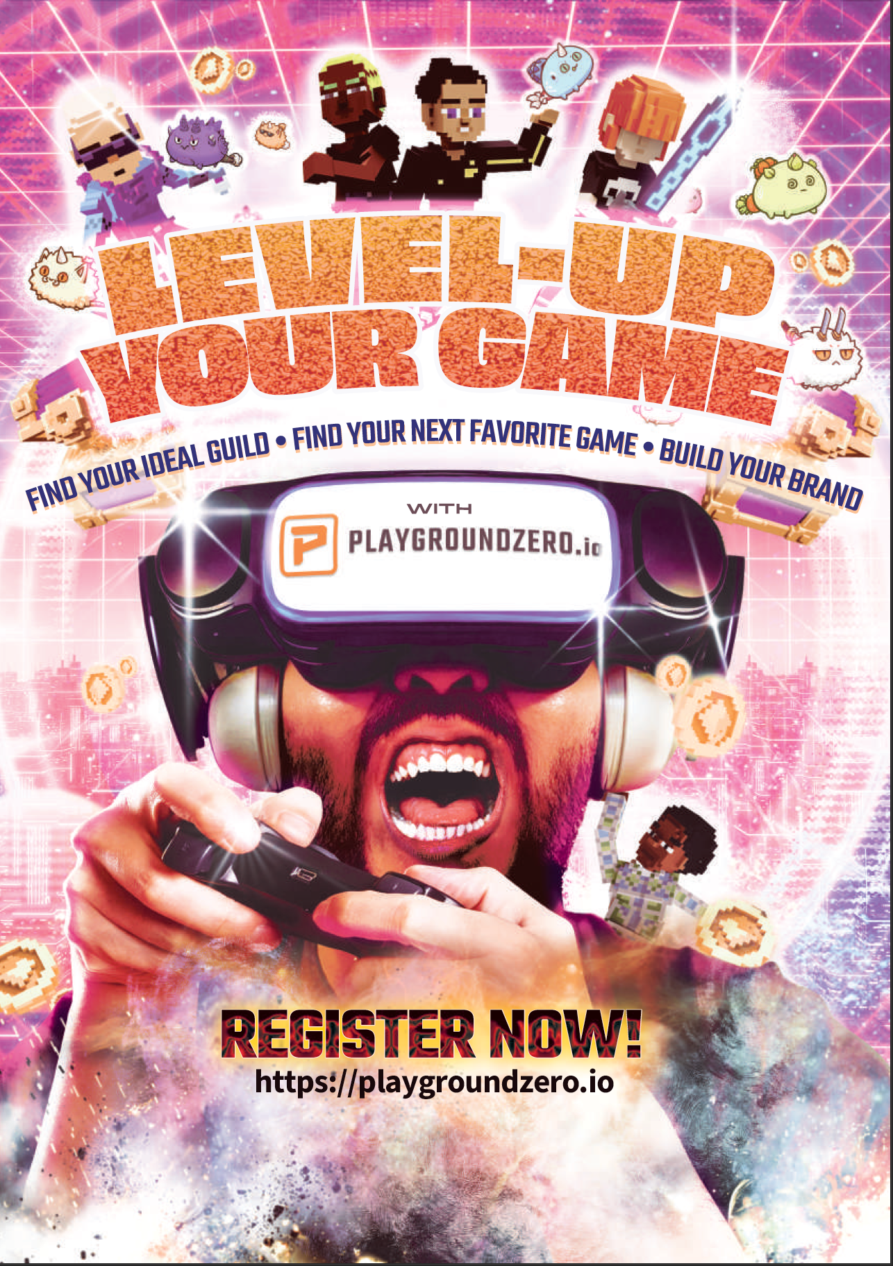
A poster study I created for Playground Zero to promote their website. Unfortunately, the idea wasn't accepted.
Poster Rationale
A poster’s primary functions are to: capture attention first and then convey informa- tion.
When designing a poster, it is important to consider 3 questions:
Where it will be used, by who and
to what means
to what means
question that I asked myself when coming up with the concept are
Who should see the poster?
How should they react?
What are they thinking?
What action steps do I want them to take?
How should they react?
What are they thinking?
What action steps do I want them to take?
It's called Design Empathy —Design Empathy is considering your audience before we putting pixels to screen.
Once established, it gives us the directionwe need to tackle the brief.
Every element of the poster has their role to play in this structure.
Efficiency is the main goal since a poster is meant to be consumed in < 5 sec-
Every element of the poster has their role to play in this structure.
Efficiency is the main goal since a poster is meant to be consumed in < 5 sec-
onds.
if we aren’t able to the viewer’s attention, is how we measure failure.
if we aren’t able to the viewer’s attention, is how we measure failure.
1
Structure and Layout
The grid-structure of the poster is based on a triangular grid structure. —meaning that all the elements are arranged with a giant triangle in the middle.
Reason being is that this structure gives us a central focus, and instead of pe- rusing a square structure, a triangle imposes power and visual weight.
It captures the attention of the viewer because of its visually interest. We chose this style because we are looking at having just 1 main focal point.
Design
When we first look at the poster, our eyes are drawn to the main subject which leads us up to our slogan “Level Up your Game”.
After which then leads us into our main selling points.
But let’s talk about the individual elements that helped us achieve this visual journey.
Background
This is the meat of our design.
Let’s start with the background.
Our background's concept around blockchain, the metaverse and the crypto-
Let’s start with the background.
Our background's concept around blockchain, the metaverse and the crypto-
space.
We use “hi-tech” and virtual elements to establish what the gamer is experienc-
We use “hi-tech” and virtual elements to establish what the gamer is experienc-
ing.
The metaverse paired with VR goggles provides an immersive experience that
The metaverse paired with VR goggles provides an immersive experience that
has only been available to us recently.
2
The background with a grid that is zooming into the player helps guide the viewer’s eyes to the center --the Playground Zero Logo.
Energy, Virtual Cities and the Color Pink
It’s not unusual that most posters in the NFT and crypto space use bright neons, pinks and purples as their color.
It’s this cyberpunk color scheme that helps inform the viewer that the poster is for the crypto space.
The Main Subject
The main subject is an intense gamer, engaged with the VR and the Metaverse.
As Playground Zero is a company built on Gaming and Finance (Game-Fi) the
As Playground Zero is a company built on Gaming and Finance (Game-Fi) the
platform is for gamers and enables them to “Level Up their Game”
—in every sense of the word.
Surrounding the gamer are elements from various NFT and Crypto gaming
—in every sense of the word.
Surrounding the gamer are elements from various NFT and Crypto gaming
companies that Playground Zero supports. It’s immersive.
Support Elements
Having Axie Infinity and Sandbox assets as part of our poster design helps add in visual elements and interest to the poster.
Players of the crypto space will discern the Axies and the Sandbox Characters fly- ing out of his head and into the metaverse
These support elements help guide the viewer where to look should their eyes wander off into the other parts of the poster.
3
Notice how everything stems from the head outward? we are directing the viewer to look at our main subject.
Even the sandbox avatar of his shoulder which is whispering game tips into his ear leads us back to him ➔ slogan ➔ key selling point.
It is only after we’ve run out of things that are interesting that our eyes rest on the CTA —> to register in the playgroundzero website.
I’ve also added some smoke, and nebulous clouds at the bottom of the layout to make sure that the user’s eyes don’t wander off into the edge of the page.
Smoke going up will lead us to the “register now” and URL.
Color Scheme
The color scheme is nothing new to the NFT space, it’s basic.
Color is what is most easily accessible, understandable and viewable.
Color is what is most easily accessible, understandable and viewable.
If we were to squint our eyes, you would be amiss not to notice that the whole scheme is a mixture of pinks, bright purples, and magenta and maybe a little bit of cyan.
All colors that “pop”.
The main reason that Crypto and other blockchain companies are leaning to- wards this type of scheme is because of the belief that being in the metaverse will -blow your mind —and what better way to say that than by getting colors as saturat- ed as possible?
Typography
If the visuals are how we look like, the typography is how we sound like.
Now that we have the attention of our audience— the next problem that we
Now that we have the attention of our audience— the next problem that we
have to solve is how do we talk to them? What do we say? and How do we say it? Given that we’re gaming and intensity is a vibe —we want our messaging to be
strong, loud and energetic
So Obviously —
Our “Level Up your Game” is typeset in Ohno’s Obviously using the greatest weight of the typeface.
Obviously ‘beefs up’ our text and makes it easy to see (and read)
Other elements are uses Playground Zero’s brand typeface— Teko and Source Sans.
Conclusion
It’s funny how we are into this wild journey into the Metaverse in under 5 seconds. but that’s what a poster’s job is.
To immerse us into the world, inform us, and give us an action step.
I’m confident that the poster even if we don’t get the registrations that we need (I hope we do though) at the very least, we would get the viewer to stop and look.
There was nothing left to chance in the design of this poster. Every element is considered to extract the most value from the collateral.